
Winning the decision made on a phone
A neighborhood restaurant lives or dies by a decision someone makes on their phone, hungry, five minutes from choosing somewhere else. The old site got in the way of that decision: slow to load, awkward on mobile, with a menu buried in a PDF that no one wanted to pinch and zoom. The goal was to win that moment.
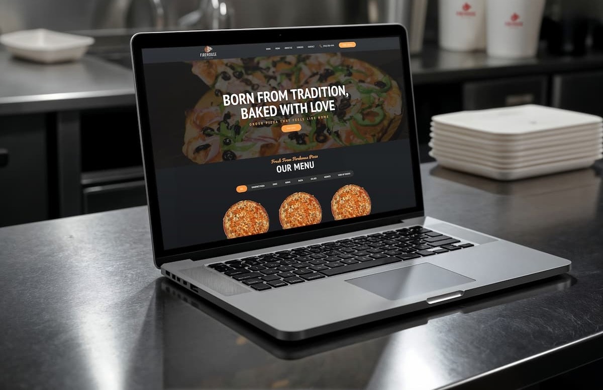
The menu is the homepage
For a restaurant, the menu is the product, so it was treated that way. It lives in real, readable text rather than an image or a download, loads instantly on a phone, and is organized so a hungry visitor finds what they want in seconds. Hours, location, and the way to order are never more than a glance away.
Fast, findable, and easy to order
Speed was a feature, not an afterthought. The site is built to load quickly on a mid-range phone over a mobile connection, because that is the real audience. Ordering is one clear path rather than a scavenger hunt, and the site is structured so search engines and map listings understand exactly what the place is and where it sits, which is how most new customers arrive.
The outcome
The restaurant traded a site that worked against it for one that does the quiet work of bringing people in: easy to find, effortless to read, and quick to act on. The menu is finally the first thing a visitor sees, and turning a passing search into a customer takes a tap, not a struggle.